Correct Answers:
A. Study the data presented in the table. Answer the following questions. Choose the
correct answer.
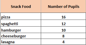
Favorite Snacks of Some Pupils
| 1. |
What is the table all about?
|
|
|
Favorite snack foods of the pupils
Snack foods
Number of pupils
|
||
| 2. |
Which snack food is preferred by most pupils?
|
|
|
spaghetti
hamburger
pizza
|
||
| 3. |
Which snack food is least preferred by the pupils?
|
|
|
hamburger
cheeseburger
lasagna
|
||
| 4. |
How many pupils prefer hamburger?
|
|
|
12 pupils
10 pupils
8 pupils
|
||
| 5. |
How many more pupils prefer pizza than spaghetti?
|
|
|
4 pupils
16 pupils
2 pupils
|
||
| 6. |
How many pupils were asked in the survey?
|
|
|
60 pupils
50 pupils
100 pupils
|
||
B. Study the graph below. Answer the question that follows. Choose the correct
answer.
| 7. |
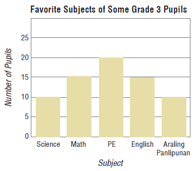
What is the title of the graph?
|
|
|
Number of pupils in Grade 3
Favorite subjects of Grade 3 pupils
Subjects in Grade 3
|
||
| 8. |
What do the bars in the graph represent?
|
|
|
grade 3 pupils
number of pupils
subjects
|
||
| 9. |
What do the numbers on the left side of the graph mean?
|
|
|
number of pupils
subjects
Grade 3 pupils
|
||
| 9. |
What do the numbers on the left side of the graph mean?
|
|
|
number of pupils
subjects
Grade 3 pupils
|
||
| 10. |
How many pupils were asked in all?
|
|
|
100 pupils
60 pupils
70 pupils
|
||
| 11. |
How many pupils like Mathematics best?
|
|
|
15 pupils
20 pupils
10 pupils
|
||
| 12. |
Which subjects are preferred by the same number of pupils?
|
|
|
Science and Mathematics
Mathematics and English
English and Araling Panlipunan
|
||
| 13. |
What subject is liked best by most pupils?
|
|
|
Mathematics
English
PE
|
||
| 14. |
What conclusion can you make about the favorite subjects of
some grade 3 pupils?
|
|
|
Most pupils liked the PE the most.
Most pupils liked the English the most.
Most pupils liked the Science the most.
|
||